
A fresh coat of paint holds remarkable power to transform any living space. The right colour selection can completely alter a room’s atmosphere, turning a dull area into a vibrant sanctuary. This transformative quality makes choosing hues one of the most impactful decisions for any home refresh.
Currently, we find ourselves at an exciting crossroads in design aesthetics. Homeowners across the UK are showing increased confidence with their choices. Many are moving beyond traditional safe neutrals towards more expressive and personal palettes. This shift reflects a growing desire for spaces that truly represent individual style.
The recent Pantone announcement of “Cloud Dancer” as its 2026 Colour of the Year created quite a stir. Many design enthusiasts expressed surprise at the choice of a soft white after years of richer, bolder tones dominating interior spaces. This development highlights the ongoing tension between minimalist preferences and more dramatic trends.
Despite predictions favouring lighter shades, industry experts widely agree on another direction. Earthy, nature-inspired hues are set to dominate the coming year. This represents a collective move towards grounding and connection within our living environments. Our exploration will cover comprehensive modern approaches, from innovative techniques to practical implementation strategies for your space.
Key Takeaways
- Colour selection dramatically influences a room’s mood and aesthetic appeal
- Homeowners are increasingly choosing expressive colours over safe neutrals
- Pantone’s 2026 “Cloud Dancer” announcement surprised the design community
- Earthy, nature-inspired hues are predicted to dominate upcoming trends
- The article explores comprehensive approaches to refreshing living spaces
- Practical implementation strategies will be covered for reader application
- Expert forecasts help guide informed decisions about home aesthetics
Overview of Contemporary Interior Trends
The landscape of domestic aesthetics is undergoing a significant transformation across British households. Current paint trends reflect a deeper cultural shift toward emotional comfort and natural connection.
Key Trends Shaping Modern Homes
Homeowners are demonstrating remarkable colour confidence, moving beyond safe neutrals. This year sees a strong preference for expressive, personalised schemes that create unique atmospheres.
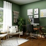
Earthy tones dominate the current palette, with rich browns and olive greens leading the way. These shades represent a collective desire for grounding and stability within living spaces.
There’s a palpable shift in colours people are gravitating towards for their homes, mirroring the collective mood with a return to colours that make us feel grounded, safe, and quietly optimistic.
Kate Palmer, Creative Director at The Painted Furniture Company
Insights from the British Market
The British market shows particular enthusiasm for these evolving trends. Homeowners increasingly experiment with bolder choices throughout their homes.
Soft earth tones and muted greens continue gaining popularity for their calming effects. These paint selections bring a sense of nature indoors, creating serene environments.
The coming year offers versatile options spanning both warm and cool shades. This flexibility allows different design preferences while maintaining natural inspiration.
Exploring Interior Painting and Decorating Trends for Modern Homes
Leading authorities in the design field anticipate substantial changes in how homeowners approach colour selection. Industry specialists forecast a move toward more expressive choices that reflect deeper emotional needs.
Expert Opinions and Forecasts for 2026
Kate Palmer, a creative director, observes a palpable shift toward colours that create feelings of grounding and quiet optimism. This reflects a broader movement away from minimalist preferences.
Josh Branigan expects 2026 to be defined by a richer, more expressive palette. Furniture and interiors experts identify specific colour families gaining significant traction.
Earthy hues provide both sophistication and comfort. These choices address psychological needs for stability and natural connection in residential spaces.
Simon Mayhew predicts light olive green will prove particularly popular. This shade speaks to our ongoing need for calm sanctuary-like environments.
Anna Hill explains that blues and greens continue as staple favourites. These tones bring versatility and timelessness to different rooms.
| Expert | Predicted Dominant Colour | Key Characteristic | Room Application |
|---|---|---|---|
| Simon Mayhew | Light Olive Green | Calming effect | Living areas, bedrooms |
| Anna Hill | Blues & Greens | Versatile timelessness | Throughout home |
| Josh Branigan | Rich Earth Tones | Expressive depth | Feature walls, kitchens |
| Industry Consensus | Jewel-like Tones | Luxury without overwhelm | Accent spaces |
The coming year shows a clear evolution from cooler palettes toward warmer, more inviting tones. Experts agree these choices reflect broader lifestyle changes seeking emotional richness.
Impact of Earthy Tones, Rich Hues and Natural Materials
The psychological pull of earthy colour is reshaping domestic spaces. These tones offer a profound sense of connection to the natural world. They create environments that feel both restorative and intentionally designed.
Olive Greens, Browns and Burgundy Accents
Olive green appears in various depths, from light, airy versions to deeper, earthier forms. This versatile hue creates a balanced atmosphere reminiscent of serene countryside escapes.
Rich brown shades have evolved, offering a softer, more refined alternative to black. Espresso-inspired tones bring drama and sophistication to a room without overwhelming it.
Deeper jewel-like shades are also gaining prominence. Aubergine and plummy tones provide emotional richness and personality. They reflect a growing confidence with darker, more expressive palettes.
Burgundy accents make a sophisticated return. This colour offers considerable warmth and depth. It is now being used in fresher, more versatile ways compared to its traditional heritage applications.
These earthy colour choices pair beautifully with natural materials. Wood, linen, and stone enhance the organic feel of the scheme. The combination creates a cohesive and grounded aesthetic.
| Earthy Tone | Key Characteristic | Suggested Application | Psychological Effect |
|---|---|---|---|
| Olive Green | Restorative & Balanced | Living rooms, studies | Calming, connection to nature |
| Rich Brown | Dramatic & Refined | Feature walls, dining areas | Grounded, stable |
| Aubergine/Plum | Emotionally Rich | Accent walls, bedrooms | Luxurious, intimate |
| Burgundy | Warm & Deep | Accent furniture, textiles | Cosy, sophisticated |
The appeal of these shades is deeply psychological. Homeowners are drawn to colours that evoke soil, clay, and natural landscapes. This trend signifies a desire for warmth and stability within the home.
Innovative Painting Techniques and Finishes
Contemporary approaches to space transformation emphasise holistic colour strategies that envelop entire rooms. These methods move beyond traditional application to create cohesive, immersive environments.
Colour Drenching and Double Drenching Methods
Colour drenching represents a significant paint trend where every surface receives the same shade. This technique covers walls, ceilings, trim, and architectural details.
The method actually tones down intensity by eliminating contrast points. Even deep colour choices feel surprisingly calm in smaller spaces.
Double drenching evolves this concept further. It uses two related shades with varying undertones. This way maintains the enveloping effect while adding depth.
Matte Finishes and Alternative Approaches
Matte finish options create velvety, light-absorbing surfaces. They work particularly well with deeply pigmented paint choices.
Limewashing offers a centuries-old alternative experiencing revival. It creates soft, textured walls with natural appeal.
Treating the ceiling as the “fifth wall” transforms a room‘s perception. Coloured ceilings draw the eye upward, making spaces appear larger.
| Technique | Best For | Visual Effect | Practical Consideration |
|---|---|---|---|
| Colour Drenching | Creating cohesive spaces | Immersive, enveloping | Reduces visual complexity |
| Double Drenching | Highlighting architecture | Layered depth | Adds subtle contrast |
| Matte Finish | Modern, sophisticated look | Light-absorbing | Requires durable formulation |
| Limewashing | Textured, organic appeal | Soft, cloud-like | Natural material compatibility |
The right application method can transform how colour interacts with space, creating environments that feel intentionally designed rather than merely decorated.
The Role of Creative Direction in Modern Home Decor
Creative directors are the architects of aesthetic evolution in residential spaces. They analyse cultural shifts and psychological needs to forecast meaningful colour directions. This professional approach transforms abstract concepts into accessible design guidance.
Design Philosophy and Trend Guidelines
Leading figures like Kate Palmer identify the move toward grounding, optimistic shades. Laura Hammett observes fashion influences translating into residential interiors. Marianne Shillingford notes the emotional connection people now seek through their colour choices.
These professionals champion carefully curated pairings that create harmonious schemes. They understand how different shades interact to affect a room’s atmosphere. This expertise helps homeowners make confident, personal selections.
Criss Design exemplifies this balanced methodology. Their guidance blends contemporary aesthetics with timeless principles. This ensures recommended schemes remain relevant beyond temporary fashions.
| Creative Director | Focus Area | Key Insight | Residential Application |
|---|---|---|---|
| Kate Palmer | Psychological grounding | Colours creating safety and optimism | Whole-room harmonious schemes |
| Laura Hammett | Fashion translation | Berry tones from runway to living space | Sophisticated accent features |
| Marianne Shillingford | Emotional connection | Personal meaning over fleeting trends | Individualised palette development |
| Industry Consensus | Curated pairings | Relationship between shades | Dynamic yet balanced rooms |
This professional design philosophy encourages spaces that reflect individual style. It moves beyond simply following aesthetic movements. The result is more meaningful, personally resonant living environments throughout the world of home interiors.
Criss Design Strategies for a Fresh Home Update
Strategic colour application transforms living spaces beyond simple wall coverage. The Criss Design approach encourages homeowners to consider architectural details, ceilings, and furniture pieces as part of a cohesive scheme. This holistic method creates truly immersive environments.
Innovative Approaches for Every Room
Each space requires a tailored design strategy based on its function and atmosphere. Bedrooms benefit from cocooning shades that promote relaxation, while kitchens might use energising tones. The key lies in understanding how natural light affects each room throughout the day.
Personal meaning should guide colour selection rather than strict trend-following. Choosing shades that trigger positive memories creates deeper emotional connections. This personalised way of thinking makes a home truly reflective of its inhabitants.
Innovative ideas include painting staircases in contrasting colours or creating bold colour-blocked statements. Matching paint to wallpaper patterns ensures cohesive, layered designs. These techniques add character and depth to any living space.
Smaller areas like powder rooms offer perfect opportunities for dramatic statements. Saturated colours work effectively here without overwhelming the senses. Testing samples in different lighting conditions helps build confidence with bolder choices before full commitment.
The overall palette should create harmony while allowing each room its distinct personality. These strategic ideas help homeowners develop a coherent design language throughout their home. The result is a space that feels both intentional and personally meaningful.
Contemporary Inspirations from Criss
The unique character of UK residential aesthetics draws from a rich tapestry of historical influences and contemporary innovations. Criss finds particular inspiration in Britain’s design heritage while adapting global movements to local contexts.
British Home Design Trends and Influences
British homes showcase a distinctive preference for cosy, layered spaces that harmonise historic features with current colour innovations. This approach creates environments that feel both timeless and contemporary.
Fashion trends significantly influence British interior choices. Runway colours from London Fashion Week frequently translate into residential palettes. Burgundy and berry tones demonstrate this crossover effect.
Muted blues maintain their appeal in British homes, offering versatility across different room types and lighting conditions.
Victoria Yardley, Victory Colours
A noticeable shift has occurred away from previously dominant grey schemes. Warmer, characterful tones now reflect regional landscapes. This change indicates growing confidence with colour selection.
| Region | Characteristic Palette | Architectural Influence | Current Trend |
|---|---|---|---|
| Urban Centres | Sophisticated neutrals | Modern conversions | Bold accent walls |
| Rural Areas | Earth-inspired tones | Traditional cottages | Nature-connected schemes |
| Coastal Regions | Soft blues and greens | Seaside properties | Light-enhancing shades |
| Historic Cities | Heritage colours | Period features | Contemporary updates |
The growing popularity of expressive colour choices reflects Britain’s evolving design style. Criss interprets international trends through this distinctive lens. The result is spaces that feel authentically British yet connected to the wider design world.
Practical Tips for Implementing New Colour Schemes
Before opening a single can of paint, homeowners should assess their space’s lighting and architectural features. This initial evaluation forms the foundation for successful colour implementation throughout the home.
Steps for Effective Colour Application
Testing shade samples directly on walls provides the most accurate representation. Natural light dramatically alters how colours appear at different times of day.
Consider the room’s function when selecting your palette. Living areas benefit from calming tones, while kitchens may suit more energising hues.
Choosing the Perfect Palette
Olive green creates sophisticated harmony when paired with crisp whites or rich burgundy tones. This versatile choice works well as a feature wall or throughout an entire space.
Building confidence with bold blues begins in smaller areas like powder rooms. These spaces allow dramatic colour statements without overwhelming larger living areas.
| Room Type | Ideal Finish | Lighting Consideration | Recommended Approach |
|---|---|---|---|
| Living Areas | Matte finish | Maximise natural light | Colour drenching technique |
| Hallways | Durable finish | Artificial lighting focus | Lighter neutrals |
| Bedrooms | Soft matte | Evening light assessment | Cocooning shades |
| Kitchens | Washable finish | Task lighting integration | Energy-boosting tones |
Understanding undertones ensures cohesive colour palette selections throughout connected spaces. Warm bases harmonise with natural materials, while cool tones complement contemporary furnishings.
Conclusion
Ultimately, the most significant shift is not just in hue, but in the intention behind colour choices for the home. The dominant trend explored here champions earthy tones like rich browns and olive greens. These shades offer versatility and a deep sense of comfort.
Innovative methods, from colour drenching to limewashing, provide fresh ways to implement these ideas. They allow for highly personalised spaces that feel like a true reflection of individual taste. Expert forecasts and colour of the year announcements guide, but personal preference leads.
We ‘ve seen a marked growth in confidence, moving beyond safe neutrals. This empowers homeowners to create expressive, characterful schemes. Whether updating one room or an entire interior, this knowledge provides a solid foundation for a successful paint project that truly transforms a space.
FAQ
What are the most popular paint colours for modern homes in 2026?
Forecasts for 2026 indicate a continued shift towards earthy tones and rich hues. Olive green, warm browns, and deep burgundy accents are gaining significant popularity. These shades create a sense of warmth and depth, reflecting a broader trend towards nature-inspired palettes.
How can I use the ‘colour drenching’ technique in my home?
Colour drenching involves painting walls, woodwork, and even ceilings the same shade to create a bold, immersive look. For a truly dramatic effect, the ‘double drenching’ method uses two tonal variations of the same hue. This approach works beautifully with deep blues or rich greens to add a sophisticated, cocooning feel to a room.
Which paint finishes are currently in fashion for interior walls?
Matte and flat finishes are highly favoured for contemporary interiors. They provide a velvety, non-reflective surface that helps colours appear more saturated and can cleverly conceal minor wall imperfections. This style aligns with the preference for a more tactile, understated luxury.
Are neutral shades still a good choice for a modern home?
Absolutely. Neutrals remain a timeless foundation. The current trend, however, leans towards warmer, earthier neutrals with subtle pink or brown undertones, moving away from cooler greys. These tones offer a versatile backdrop that allows for bold accents and natural materials to stand out.
What role does a creative director play in home decor?
A creative director establishes a cohesive design philosophy for a space. They guide the selection of a colour palette, materials, and overall aesthetic to ensure a harmonious look. Their expertise helps translate broader world trends into a personalised, stylish scheme for your property.
How can I incorporate natural materials into my colour scheme?
Natural materials like wood, stone, and linen complement current colour trends perfectly. Pairing olive green walls with oak furniture or using a burgundy accent wall against a rattan light fixture enhances the organic feel. The key is to let the textures and colours work together to create a calm, grounded atmosphere.